Assignment 10, Poster and Slide Examples
Poster Example 1
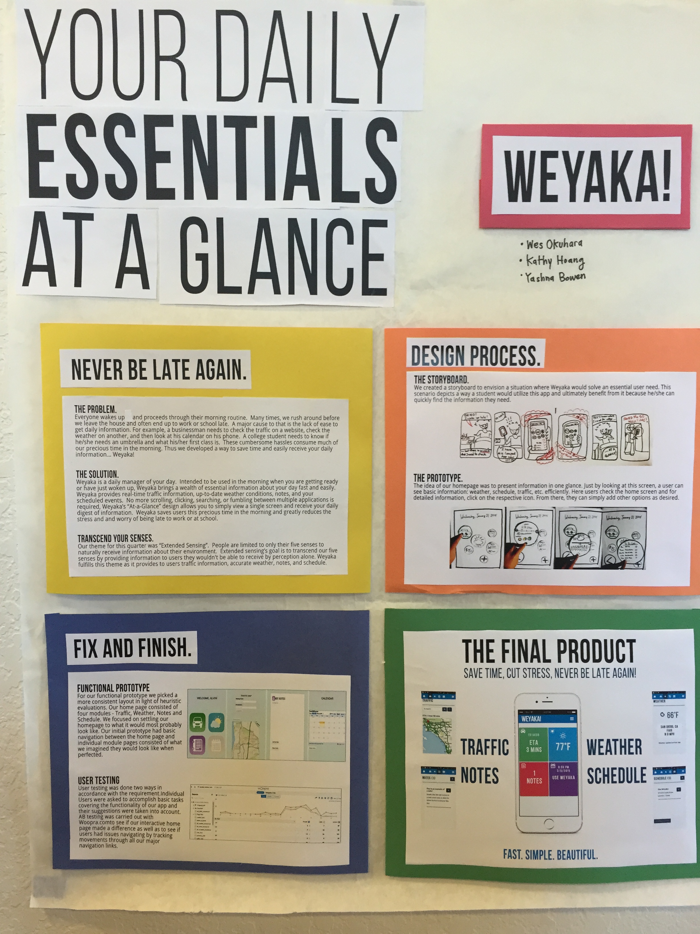
This poster is on butcher paper but is still visually appealing, and well describes the app, design process, and point of view. It is worthy of an A.
Poster Example 2
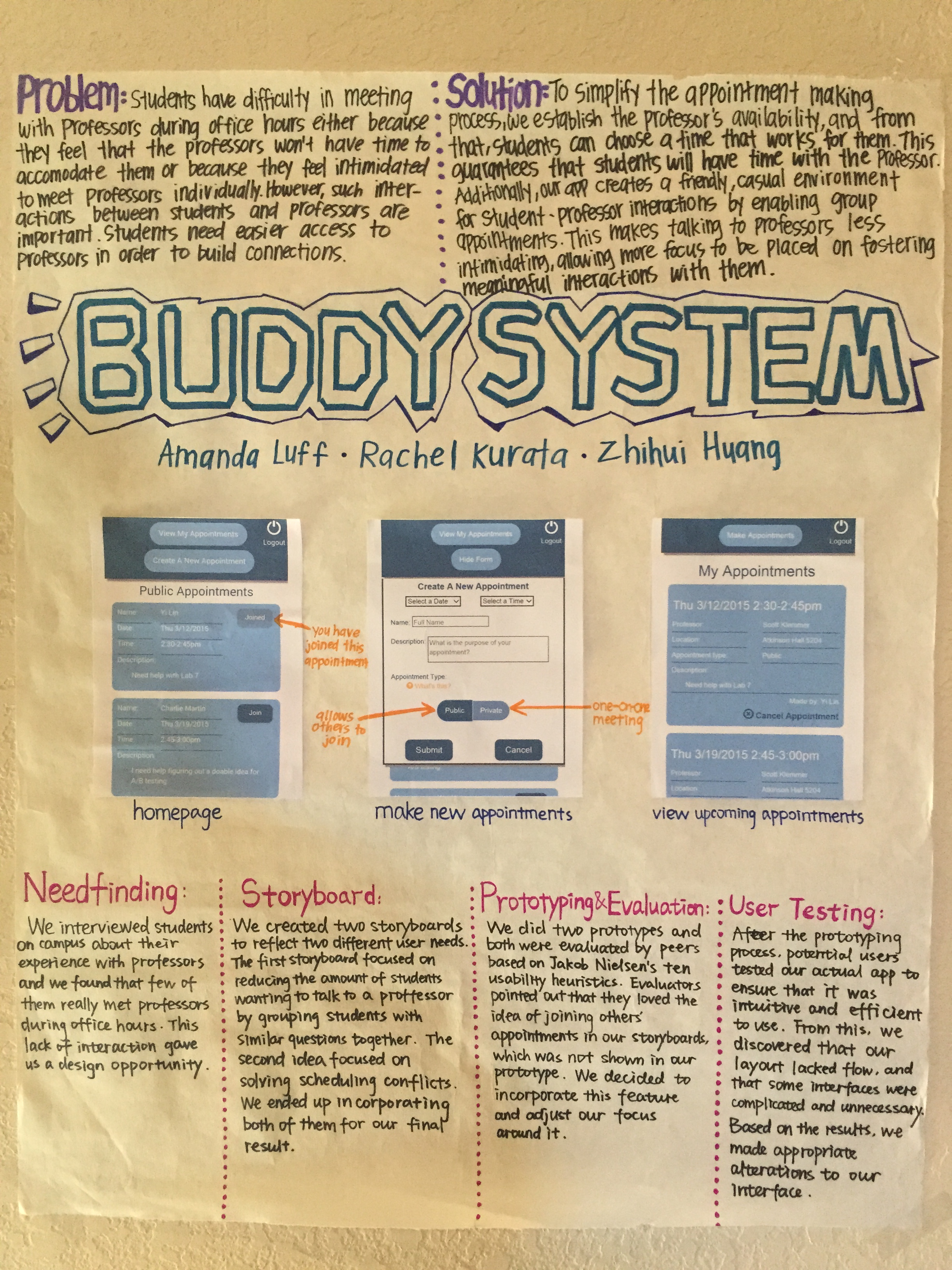
This poster is on butcher paper but is still visually appealing, and well describes the app, design process, and point of view. It is worthy of an A, though it is a little wordy, as novice posters tend to be.
Slide & Poster Example 1
Slide
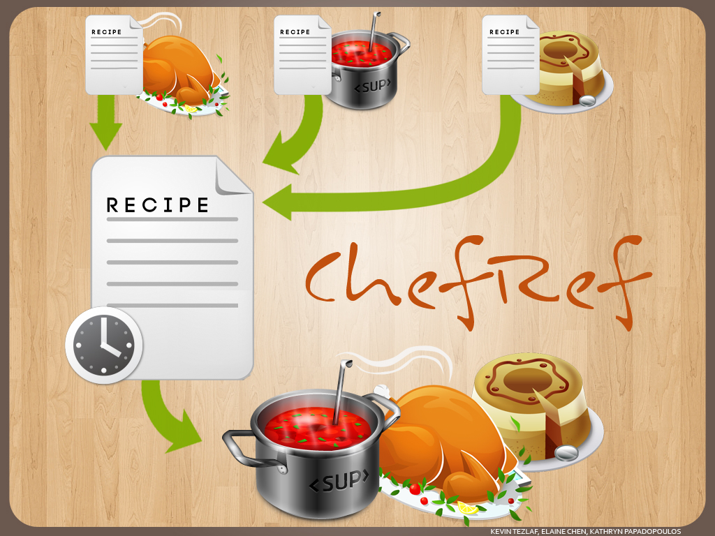
This slide does well in portraying the functionality of the app in a visually appealing way. It is worthy of an A.
Poster
Keep in mind this poster is LANDSCAPE and we required PORTRAIT. It is worthy of an A.
Slide & Poster Example 2
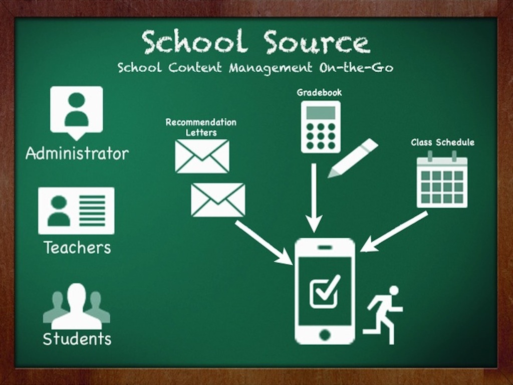
Slide
This slide does very well in portraying the functionality of the app in a visually appealing way. It is worthy of an A.
Poster
Keep in mind this poster is LANDSCAPE and we required PORTRAIT. It is worthy of an A.
Slide & Poster Example 3
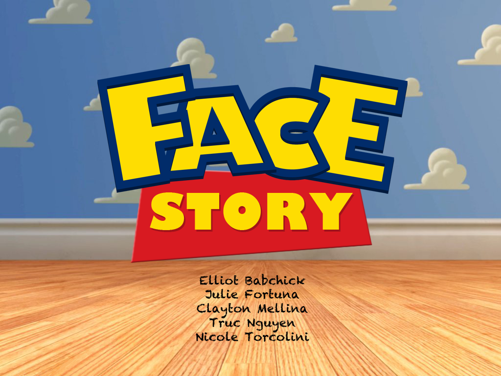
Slide
This slide is visually appealing, but does not describe the app at all. It is not worthy of an A.
Poster
Keep in mind this poster is LANDSCAPE and we required PORTRAIT. It is worthy of an A, though it is a little wordy.
Poster Session Example 1
Slide
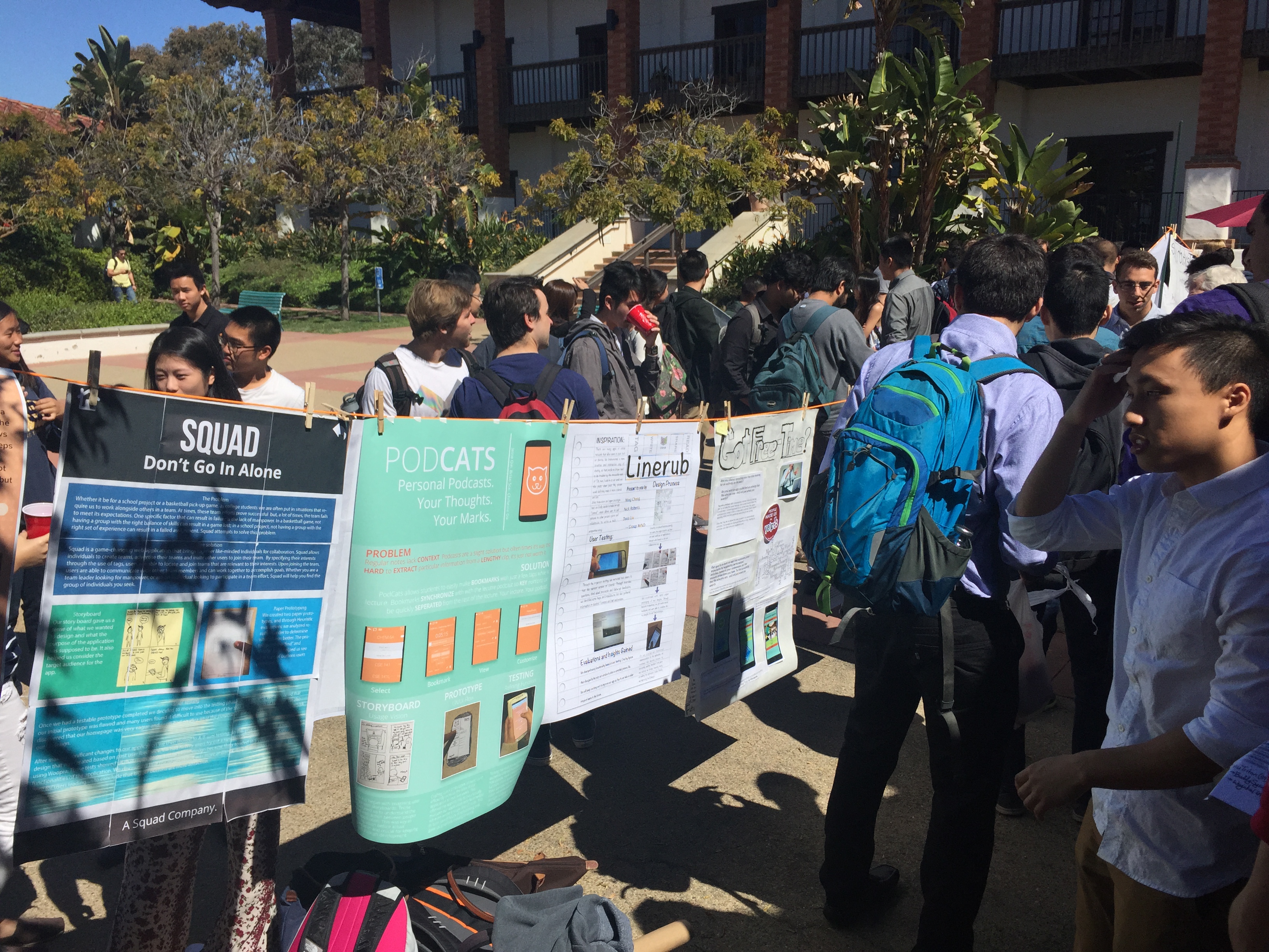
Here is a photo of what the poster session will look like. You may notice one of your TA's and his team's poster PodCats ;).
