Assignment 8, Example 1
In-person Testing
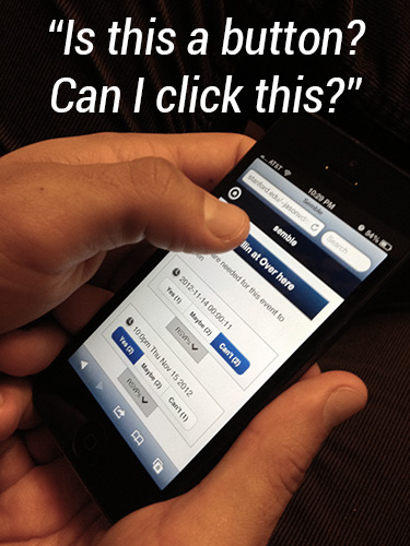
Test #1: This person thought that the title of the event was actually a button that you could click on. The person tried to click on the non-existent button for about 3 seconds and then figured out that it did nothing. The rectangular shape and the gradient could mislead people; however, the other participant did not have this issue.
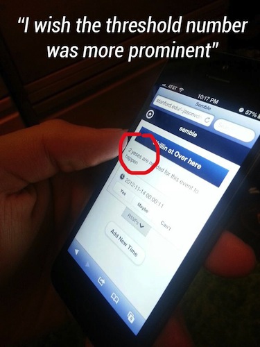
Test #2: This person thought that the threshold number (in this screenshot '2') was too small. He thought that this was an important piece of information that was not given enough emphasis.
Consent forms were included in the original submission here.
Here is the usability script that was used to maintain some level of consistency between sessions:
Usability script:
- have participants receive a text with the message: "Bball? <URL to app>"
- users navigate to event page
- decide to rsvp to time or add new time
- return to my events screen
- decide to add new event or not
- log out
- log back in
- leave participants to explore
Things to keep an eye out for:
- How easily can people find out and use the pull down RSVP shelf?
- How easily do they understand why the app could be useful? What do they say are the positive aspects of the app or the cases in which they would use it?
- What do they understand about the threshold functionality?
- How easily can they navigate between the event pages and the my event screen?
- Are they confused by the "back" button as some were during our in-class heuristic design?
- What do they make of the fact that alternate times cards are ordered by the time they were created and not by the time suggested on the card?
- What do people want to do, but are unable to do in the current implementation?
List of Changes
Changes implemented in this iteration
- Simplevent logo on login screen needs to be changed to semble (Small oversite when we changed the name.)
- Fix formatting and implement custom theme on login (Theming was inconsistent - needed to be fixed.)
- set up semble.co domain name (some people were confused by the bit.ly domain name. Using our own domain name should clear things up.)
- Finished back end wiring so that events are linked to time modules. When times are added, the times persist and are saved in the database. New tables were created for more database storage. (Improvements to back end will make the app function more realistically with less hard-coded database content.)
Changes started in this iteration and will be continued in the next iteration
- Set up redirect from semble.co to event page, semble.co/event takes you to an event page (People were a bit confused why bit.ly was used as the shortlink to events. Using our own domain name now will clear up the confusion.)
- Implement sign up page - change username to phone number as the unique identifier and prompt users to select which carrier they have (AT&T, Verizon, etc.) (Both people were expecting / desired this feature because they wanted to be notified when the event time was settled upon without returning to the app. They said that they would give their phone numbers to the site given this use case.)
- Put shortlink at the top of events page so that people can copy and paste it. (One person wondered how he might share the event to friends in the first place if he lost the original shortlink. To fix this we implemented a small 'i' icon at the top of the screen that reveals a popover when clicked and gives the person a shortlink to the event that they can copy and paste.)
- Change the threshold number so that it is large and visible at a glance. (One person complained that the threshold number was too small and not emphasized enough even thought it was an important bit of information that needed to be recognized at a glance. We redesigned how this is portrayed so that the threshold number is larger and more prominent.)
Changes for next iteration
- Send attendees text notifications when one of the events reaches the desired threshold indicated when the event was created. (As stated earlier, both participants desired/requested/expected this feature. We will change the person's unique ID from email to phone number because this seems to be a more useful piece of contact information. We will also need to collect the person's carrier so that we can send an email to the [number]@[carrier].com that will forward the message via SMS to the users phone. Both participants said they would agree to give up their cell phone number if it was to be used to notify them of a finalized event time.)
- Put progress bars on each of the time cards. The progress bars will be incremented with each yes vote and will reach completion when the number yes votes is equal to the given yes threshold for the event (set by the owner of the event). (It was clear during the in-person testing that the people took some time comparing different time cards to see which ones were closest to the threshold. In order to accelerate the comparison process we will provide progress bars with three-way redundant coding. The progress bars will indicate the proximity of the event to yes threshold by proving the visual bar increasing in size, the percentage of yes/threshold, and a color change as the bar gets closer to completion. This visual system will provide more information at-a-glance and we hypothesize that the redundant coding will make the experience of comparing times more efficient.)
Paper Prototype Redesign
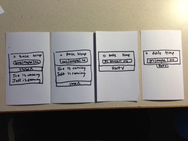
These show redesign possibilities for people that were slow or hesitant to use the close and rsvp button. The far right shows the button as is (skinny). Second and third from the right shows a variant that is wider. And the variant all the way on the left shows a variation on the wide button where the button that opens the shelf stays in a constant position. This was a a problem during the in-person test because participants were having trouble closing the shelf when the close button slipped below the fold of the phone. You can see how this can be a problem in the variant second from the left but how it it might be improved in the variation on the left.
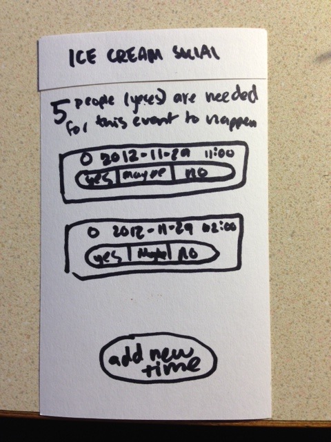
The top image here shows the app as it currently is with a box around the title. The second variation shows that boxed removed to show a more simplified and traditional title design. One person in the in-person test thought that the box was an affordance for a link. The second variation attempts to eliminate this affordance cue mistake.
Online Test Plan
Experiment #1: Can I click it? Yes you can?
Our in-person testing data showed the some people perceive the event title, which is currently contained in a gradient-shaded blue rectangle at the top of the event, as a clickable button. This may be a perception by few or many people, but the small sample size of the in-person testing group doesn’t help us generalize and answer this question. Thus, we will turn to online testing to increase the sample size, gather more data, and see if this perception is held by a significant population of people. In order to test this, we will have two interfaces to A/B test. One interface - the "A" - will be the original implementation of the button as it was in our user testing with the title contained within a blue-gradiented rectangle and the alternative - the "B" - will be a sort of addition by subtraction: removing the rectangle and making the title simply black text on white background in a size suitable of a header (slightly bigger than the body text). The "B" version draws on the the notion of a visual hierarchy (larger text + high on the page) to convey that it is the title, while the A version relies on style differentiation and positioning (different color + high on the page) in order to convey its function. Hopefully our online test will let us know which version fewer people click on. Clicks to this area is a negative in this test, as clicking on the title is the user behavior that we are trying to minimize in this experiment.
Experiment #2: The RSVP shelf button. (Size? and Stationary?)
We saw that opening and closing the RSVP shelf was a bit clunky in the in-person tests. So we designed some alternatives. In one variation we decided to make the shelf button bigger so as to provide a larger target area for our users to click on. In addition we also went a step further in a second variation to include not only a larger button but also an RSVP shelf button that stays in the same position when it is opened and closed. We noticed that it was a bit unnatural in the current implementation for people to have to click in two different locations on the screen to open and close the shelf. We hypothesize that keeping the button in one location but changing the text from RSVP to close will increase users propensity to click and close the shelves which is key to using the application. In this test we have two variations that will both be compared to each other and the original control design.
Note that experiment 1 and 2 will be run in the same session. Since both variations ultimately will be compared back to the control design we can combine the experiments into so that we can get more data with fewer people in less time.
Also note that this test provides small incremental variations that build upon one another. This is to avoid confounding variables and to focus in on specific causal relationships between the independent and dependent variables of our test. If we wrapped all of the changes into one we wouldn't know which changes were the ones that caused the results. So instead we split the changes into 3 variations that all can all be compared back to the baseline original design (1 variation for the header experiment and 2 variations for the RSVP shelf).